Although I have certainly posted my fair share of kitchen pictures on the blog, I have never devoted a post to my favorite kitchens. Yet, it is one of the most popular search terms on my blog. Perhaps I have not focused extensively on kitchens because I have been relatively satisfied with my own kitchen; despite the fact that my home was designed in the late 80s and my kitchen bears many of the hallmarks of that time, the appliances were top of the line at the time, and the layout is quite good.
However, now that some of the appliances are getting old and I am thinking more and more of my 'dream home', I have started to pay close attention to kitchens. This post is a compilation of the kitchens I love, and a recent kitchen post at one of my favorite blogs - the Material Girls - inspired me to go ahead and post on the room where I spend the most amount of time in my own house. When compiling this post, I found it interesting that the kitchen pictures I like the most are the ones that I have saved over the past 9 months. Kitchens become dated much faster than any other room in the house, and seem to be susceptible to the latest and greatest in trends. Although I like to think of myself as classic, traditional with a twist, I wonder whether I am influenced by the trends of the day? Take a look at these pictures, and let me know what you think.
This is my current favorite kitchen - a departure from my usual love of white cabinets, but there is something about it that really speaks to me.
This kitchen was in an Atlanta showhouse a few years ago, and it is incredibly beautiful. Kitchen design was by Matthew Quinn of Design Galleria, one of the lead kitchen designers in the Southeast. The beautiful stone range hood is by Francois & Company. I really love the layout and design of this kitchen - it has a moody elegance due to its color scheme, and has beautiful details. Image via Better Homes and Gardens Kitchen and Bath Ideas, photography by Michael Partenio. (Check out the Design Galleria blog - it is very clever. A word is selected for each post, and a design element is selected that reflects the word.)
The people who bought the showhouse hired designer Suzanne Kasler when they moved in; Suzanne put her own touch on the space with a zinc table and antique chairs with original leather upholstery. I love those fridges - two subzeros with a custom cabinet face to match the rest of the kitchen. It makes the fridge look like a piece of furniture, an impression further enhanced because of the height. This image is in Suzanne's new book, just released last week; the book can be purchased wherever books are sold, and a signed copy can be purchased on her website (click here).
This kitchen is a recent addition to my picture files; there is something about it that has great appeal to me. It has a very elegant French feel. One side of the kitchen is windows, an unusual arrangement in a kitchen where wall space for appliances and storage is usually at a premium. Design by Beverly Ellesley, via Decorati blog, a great design blog worth checking out.

I immediately noticed the Niermann Weeks Avignon chandelier, however, my favorite feature is the antique French flooring used on the island. As the designer said, flooring is strong enough for foot traffic, so it is definitely strong enough to take the wear and tear of a kitchen counter.
This is a Victoria Hagan designed kitchen, and there is so much to love in this space: the beautiful quality of the light that flows through the windows, the streamlined and simple lines of the counters and cabinetry, the crisp white contrasted with the dark countertops, the sophisticated lighting.
This kitchen was one of the winners of the 2008 Atlanta Homes and Lifestyles kitchen design contest, and was designed by Mary Kathryn Timoney of Design Galleria, one of the top kitchen studios in Atlanta. Image via AH&L. I can see a theme emerging - the light and dark contrast really appeals to me in a kitchen. I love the herringbone pattern of the tile behind the range - simple, but elegant.
I promised myself not to post this kitchen on my blog again - but how can I do a kitchen post without one of the most charming kitchens I have seen this year? It is the winner of the Southern Accents Kitchen Award 2009. What appeals to me about this kitchen? I love the colors of the walls and cabinets, the vent hood (one of the prettiest I have seen), the decorative medallion, the furniture-like look of the cabinets and the storage, the fact that there it is a happy medium between the desire to have very few overhead cabinets, but the practical need to have a few well placed cabinets. Generally, I prefer to have the casual dining area in its own nook, but I love how designer Gwyn Duggan has integrated the seating into the island; instead of bar stools, the table is placed quite close to the island so it does not disrupt the flow between the kitchen and the adjoining family room.
There is something so appealing about this relatively compact kitchen. Perhaps it is the soothing tones, the sheen of the tiles and the ceiling. It has many of the elements I admire - a nice big window over the sink, a range with pretty architectural vent hood. The floors look beautiful too - it looks like a chevron or herringbone pattern using bleached wood.
Another view of this kitchen. It looks like the counters are made of polished marble.
A kitchen designed by Jim Howard. I had the pleasure of seeing this house in person with Jim as the tour guide, and it was amazing to hear about the design decisions behind each room. I love the clean lines in this space, and the elegant clear pendant lights over the island. In Atlanta, most custom kitchens these days have marble countertops. When I asked Jim about this, he said that European kitchens have used marble for decades (even centuries), and part of the beauty is in the patina that they acquire over time.
Earlier this year, I declared this to be my 'dream kitchen'. I love how it looks - with its soft cream and brown palette, the random pattern on the stone floors, the enormous window. In reality, this kitchen is a bit big for me (it is in a house that is almost 14,000 square feet, so it is in scale for the house), but its size is part of the drama. The large window that lets the light stream into the room is simply breathtaking. I also like the color scheme - cream with dark accents - and the random pattern of the floor. Of course, the Barbara Barry script chairs are one of my all time favorite bar stool designs.
Lighting seems to be something that can make or break a kitchen. Elegant and simple globe lighting like this allows the kitchen to be the star of the show, with a little sparkle. This kitchen meets all of the criteria: nice big window, beautiful range and vent, large island (although, I am too practical to have an open island like this - I want to maximize storage). Image via Brooks & Falotico Associates.
Brooke of Velvet & Linen did a post on vent hoods recently - and it was eye opening to me. I think this post made me realize how much I like a decorative vent hood that is the focal point of the kitchen.
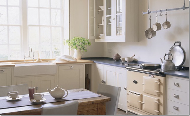
My Aunt in Scotland has an Aga range like this - she swears by it. I have only seen an Aga once in an Atlanta home. I didn't save this picture for the range, though; I liked the light and dark contrast, the farmhouse sink, and the huge window. To me, a bright and sunny kitchen is of utmost importance.
I love the colors in this kitchen - the cream and black (or is it dark, dark brown) theme is cleverly done, with black counters, oil rubbed bronze cabinet hardware, then a cream counter over a dark island base, and finally the combination of the two colors in the tile behind the range. The range hood is large and very dramatic. Via the Jack Arnold, architect web site.
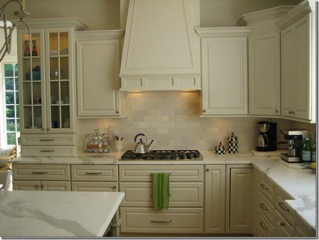
A reader of Cote de Texas sent in pictures of her kitchen, and the simple beauty and soft color scheme really appealed to me. Look at those beautiful marble countertops - the colors in the marble veins are picked up in the variation of colors in the subway tile backsplash. I think that marble is the most beautiful countertop out there - but I am trying to talk myself out of using marble in my next house because I cook every day, and I am a very messy cook. I just don't think I can handle a high maintenance countertop. Anyone with marble counters want to weigh in on this?
Another white kitchen - these really seem to speak to me - and I love the sparkle of the chandelier in this space. Design by Heidi Friedler.
When looking at these pictures, it is clear what elements appeal to me in a kitchen: lots of natural light, either a combination of light and dark contrasts, or a tone on tone with creams or whites. Many of the pictures seem to have a wood surface on the island, although marble is also prevalent in all of these kitchens. Given how my taste in kitchens has shifted over the past year, it makes me nervous about the choices that I will be making in designing my next kitchen. I guess the important thing is to keep the design simple and streamlined, with an emphasis on function first (I love a good work triangle), as well as color (not pattern - I always tire of a pattern) - this always seems to serve me well.


