Monday, September 28, 2009

Inspiring Architect: Steve Giannetti

Last year, a new blogger burst onto the scene, and from the moment her blog started I was a fan. The blogger is Brooke Giannetti from Velvet & Linen, and one of the things that immediately endeared me to her blog was its unique focus on both design and architecture - two of my passions. In fact, in Brooke's very first month of blogging, she created a post called 'A Wonderful Collaboration' - and I learned that Brooke's husband Steve Giannetti is an architect. Could it get any better - a blog written by a designer whose husband is an architect? Brooke recently celebrated her one year blogging anniversary, and her blog continues to amaze me with every post. My favorite posts, though, are the ones where she shows the houses that Steve designed, and I particularly love the ones where Brooke did the interiors.

Steve Giannetti graciously agreed to answer a few questions for me as part of my 'Inspiring Architects' series. I loved learning more about Steve's background and the inspiration for his work.

Steve Giannetti

Q: How did you decide to pursue a career in architecture?

Steve: When I was a child, I really enjoyed drawing and building. As I got older, I found that I also really liked solving problems.

Growing up I worked for my father doing ornamental plaster work. I would come in contact with a lot of architects. So, when I was in high school I started hanging out at the Architecture department at the University of Maryland. In my free time I would do the projects that were assigned to the architecture students. I enjoyed it so much that I applied to the architecture program and got accepted.

shapeimage_1

Steve grew up surrounded by the beauty of an ornamental plaster studio, which developed a love for attention to detail that makes Steve such an exceptional architect.

Q: From where do you draw your inspiration? Particular architects, things, places?

Steve: I like Classical architects like Thomas Jefferson and John Soane. They always came up with clever solutions to problems. Soane's house in London, now a museum, is amazing with all sorts of ornaments that remind me of my dad's shop.

020Interiors

Sir John Soane's house is considered one of the most magnificent house museums in the world. Here is a picture from the museum.

breakfastroom

The breakfast room from Sir John Soane's house - no wonder Steve cites this as an inspirational place for him.

breakfastroomceiling

The ceiling of the breakfast room - amazing architectural and design detail.

Steve: Pierre Chareau did a great house in Paris in 1930 called Maison de Verre. It looks like it could have been done last week.

maison_de_verre

The exterior of Maison de Verre (House of Glass). Chareau's patron purchased the first three floors of the building, but the person who owned the top level would not sell. Undeterred, Chareau simply worked with the space his patron owned, without disturbing the the original top floor, in order to create this masterpiece of architecture (source: Wikipedia).

4-29-08bookcase1

The wall of books in Maison de Verre.

maison1

Another view - I love the concert grand piano in front of the wall of glass.

Q: Do you have a particular style of architecture that you favor?

Steve: I work in all kinds of styles. Classical architecture is always fun, but I tend to open it up more with glass when I can.

P1030793

A home that Steve designed.

IMG_4292

The light filled interior of the home pictured above; note the architectural details in the transom of the doors. Special details like this are what make homes unique and exceptional.

Steve: I am working on combining the open space and flow of Modernism with the proportions and humanity of Classicism. I try to simply things a bit more these days. This is the style I favor right now, unfortunately I don't know what to call it yet. We are doing a couple of projects right now with this in mind.

I am also just finishing work on another home in Malibu that combines some traditional Mediterranean details with a modern feeling.

DSC_0632

DSC_0646

A home (designed by Steve) that is in the finishing stages.

DSC_0240

DSC_0201

A house and barn in Maine is nearly complete and is a design that blends traditional shingle style with a more modern interior.

Q: What is your favorite exposure for quality of light (North, South, East, or West), and why?

Steve: South. This exposure allows a quality of light into the room in a way that energizes the space. North light is very static and doesn't move around, so the room always feels the same. I'll work pretty hard to get south light into a room with dormers or sidelights.

DSC_0141

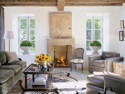
A recent project of Steve's, in collaboration with Brooke, was a pool house/artist studio that had a beautiful quality of light.

Q: What types of projects do you work on (i.e., size of home, renovation vs. new contruction)?

Steve: There is no real average size. They range from 4000 sf to 10,000 sf. I do both new construction and renovation, although I prefer new construction.

A charming French style home designed by Steve.

Q: What is something you should not skimp on what building a home?

Steve: A detailed set of plans. Nothing is more expensive than indecision when you are building a house. It holds up the building process. The more detailed the drawings, the less questions a builder will have and the quicker it will all go.

arch_vl1

One of my favorite pictures from Steve's portfolio - there is something so beautiful about this little arch under the stairs, and every time I look at the photo I notice another architectural detail.

Q: What trends are you seeing in your projects? Smaller, larger, green? Classical, modern, a blending of the two?

Steve: I see people asking for smaller houses with cleaner, minimal details that still have warmth of traditional architecture. Also, my clients really prefer an open floor plan, so the rooms feel bigger. Living rooms are also going away and being replaced by bigger libraries that also act like intimate living rooms.

library

A beautiful library in a home recently designed by Steve.

Q: What is a fad you hope to never see again?

Steve: Lava rock. We had a huge wall of it in our place in Oxnard that we just had to plaster over.

CIMG8311

The lava rock wall: before.

P1040512

The wall after Steve plastered over it. This space continues to evolve - Brooke has been documenting the renovation of the house on her blog.

I hope you enjoyed this interview with Steve Giannetti. Although I have admired his work many times over the past year, I really did not know much about Steve other than the small tidbits I read on Brooke's blog. As you can see in this post, Steve's inspirations are from the Classical tradition in architecture, yet he is putting an exciting new modern framework on these Classical designs, which makes them so suitable for life in the 21st Century. Steve truly said it best when he wrote of wanting to retain the proportion and humanity of the Classical tradition, with the space and flow of modernism. For more information about Steve, Giannetti Architects, Giannetti Home (Brooke and Steve's store that sells Steve's original furniture designs), and Brooke's blog, please visit the Giannetti website.

Come see what everyone is posting about on BNOTP Metamorphosis Monday!

Friday, September 25, 2009

Inspirational Design Talent: Amy Morris

I was first introduced to Amy Morris through the Atlanta Homes and Lifestyles bathroom design contest:

This is such an exquisite vignette, with the freestanding tub, the beautiful French style mirror behind the tub (reminds me a bit of the work of Kerry Joyce, with an Atlanta twist), the petite French chair, and the side table with my favorite flower - tulips. The bathroom has wood floors, a bathroom trend I am seeing more and more. What's not to like about this picture? Atlanta Homes and Lifestyles has a particular strength at identifying and promoting the best new emerging talent in the Southeast design scene; based on this picture, I decided to check out the designer's web site. Be prepared for some beautiful never before seen images!

amydmorris5

Designer Amy Morris clearly she has an incredible eye and a great talent for creating beautiful spaces. This is the image that greeted me at the front page of Amy's website, and it was a wonderful introduction to Amy's work - overall neutral, with texture and interest. I love the lines of the bookshelf, the mixture of seagrass baskets with parchment books, glass paperweights, and architectural fragments. The amazing photography of Emily Followill makes the vignette even more beautiful (all images by Emily Followill, used with permission from the designer).

amydmorris3

Another vignette from the front page of Amy's site, with a combination of some of my favorite elements: the symmetry of two lamps, flowing silk curtains, a lyre back chair (a musical shape that I love), and the 'x' motif in a beautiful desk.

090115_066

Amy likes to mix it up in her designs, and often uses great abstract art with treasured family pieces and wonderful finds at local haunts like Scott's antique market.

entry.2

Another space where Amy made a charming and completely unique vignette that defines the entry to the home. I love it when a home has a long wall like this in an entry - it makes for so many possibilities on the decor side of things!

amydmorris.090316_102final

Amy worked with Atlanta design star Barbara Westbrook for five years before starting her own firm in 2005. From Barbara, she gained an appreciation for traditional and French modern design, although she describes her current direction as transitional design with a clean, fresh, and eclectic style.

amydmorris.090316_029

amydmorris.090316_037final

I absolutely love the style of this room, as seen from different angles. It is richly colored and very sophisticated; although I usually gravitate to a lighter palate, there is something about this room that makes me want to pick a room in my house and make it cozy and gray. The dash of teal in the antique chair is a perfect balance.

amydmorris.090316_074final

Another bathroom where Amy uses a full length mirror leaning against a wall, also set behind a free standing tub. I love how the color of the tub is a perfect match for the color of the fabric in the shade.

amydmorris.090316_057final

I originally thought that this was part of the same bathroom, but the floor is much darker. The same color in the fabric of the window treatment is used, which is carried through to the charming chair at the vanity.

amydmorris6

amydmorris.090316_112final

This is a great casual dining area, with its slipcovered chairs, grass planter on the table, and glass lights hanging from ropes.

amydmorris.090316_151final

Here is a kitchen designed by Amy. There are so many interesting elements going on here - the beams on the ceiling (adding that great third dimension to the space), the layout on the far wall, with no cabinets, two windows on a wall done entirely in tile, a giant clock, the two lanterns above the island.

amydmorris.090316_125final

Based on the beams, I am guessing that the previous three pictures are part of the same house. I love the contrast of the trim color on the doors.

amydmorris.090316_083final

A powder room, which is so rarely seen in magazines and portfolios. This one is charming.

amydmorris.090115_081

A sophisticated bathroom designed by Amy.

amydmorris.090316_142final

What a great use for a small wall in a stairway. The four ebony medallion reliefs look like giant intaglios. Does anyone know what these are called? I love the settee along the stair wall too; the pillows provide a little dash of color.

amydmorris.090316_044final

This is my favorite picture from Amy's website. I am not sure if it is the bed - one of my favorite styles, by Lewis Mittman - or the intaglios hanging above the bed - or the combination of all the elements, but it is definitely a design that speaks to me.

For more information on Amy Morris' work, please visit her website. Amy is one of the featured designers in the upcoming Atlanta Homes and Lifestyles Christmas House; she will be designing a bedroom. Based on everything I have seen on her website, it will be spectacular!

Come visit Hooked on Houses to see what everyone else is posting about this week!

Wednesday, September 23, 2009

Glee


I am going a little off topic to spread the word about my new favorite show: Glee. Have you seen it? It is a wonderful mixture of adult soap opera, high school drama (which, despite being in my late 30s, I have an unreasonable love for high school shows), comedy, and musical. I love it, and look forward to Wednesdays when it airs on Fox. I even watch it live - virtually unheard of for me in the age of 'on demand' tv and TiVo.

Here is the trailer:


And a great clip:

http://www.fox.com/fod/play.php?sh=glee&ep=1251342903382

All previous episodes (there are just a few) can be seen on the Fox website, just click here. Watch the pilot first to get the background of the show (although I didn't do that - I watched the second episode first and had no trouble). Welcome to the Glee club - once you watch you will be addicted!

Tuesday, September 22, 2009

The Third Dimension in Architecture and Design


Recently, I profiled Massachusetts architect Katie Hutchison. When I first learned of her online articles, I was particularly smitten with Katie's discussion of the third dimension in design and architecture. In her article, Katie wrote:

"You would think it would be obvious, but sometimes it needs to be said: attention to the third dimension is critical to shaping space. All too often in a rush to plan room-to-room adjacencies and sequencing on a particular floor level, treatment of the third dimension becomes an afterthought".

After reading Katie's article, I went through the pictures in my own inspiration files to see where the 'third dimension' adds to, and even defines, a space. Many of the examples I found were in the beautiful ceiling treatments that the designers and architects used, but there are so many possibilities for adding the third dimension to a space. Here are some of my favorite examples.

christopher_maya

This picture has circulated around the blogosphere, and it seems as if the ladder is the feature that captures everyone's attention. The ladder and the opening at the top is the third dimension that gives definition to this large two story space. The mystery of what is at the top of the ladder is part of the intrigue of the room. Interior design by Christopher Maya.

Katie says that an area often neglected is the ceiling, and many designers see it as the perfect canvas for a beautiful design feature. This ceiling, in Marble House, Newport, was one of the most memorable features of the home. The intricacy of the ceiling and the fretwork all around the room was breathtaking to see in person.


My favorite stately home in England, Blenheim Palace, has a beautiful library that is my favorite room in the house. The eye is naturally taken up to appreciate the detail on the ceiling, and the shape of the space makes it feel like you are passing through an amazing portal. At the end of the space: a magnificent organ.

saladino

John Saladino is perhaps the master at making every space full of subtle dimension; every surface is an opportunity for a statement, whether it be subtle or bold. The walls are textured and appear to be carved out of stone, an impression solidified by the columns that flank the door. The leather door with the detail in nails is so original and adds so much to this space - it simply would not be the same with just plain painted wood doors.

BBR2_WS

I love the look of this entry to designer Frank Babb Randolph's townhouse; he added the door surround, which is quite sculptural and defines the style of the house. I am a big fan of beautifully defined front doors as the perfect introduction to a home, and a great extra dimension to a house.

bunny_williams

This is an amazing interpretation of a staircase, in an entry designed by Bunny Williams. There are so many elements in this space that add the 'third dimension' - the texture of the walls, the columns in the window above the stair, the wave pattern on the floor, the curve of the wall, and of course the magnificent stairs.

cdt_chandelier

The groined ceiling and detailed columns are the the third dimension of this space that makes it extraordinary. Would a flat ceiling and walls have the same impact?

powers_cdt

This unusual room has a recessed ceiling and a curve built into the wall, a third dimension to the room that makes it very powerful from an architecture and design perspective. The shape of the dining chairs reflects the shape of the room, in a nice use of a repeating design element. Interiors by J. Randall Powers.

velvet_linen2

Do you notice that the area for the console is recessed in this room? A unique architectural feature that gives this room extra dimension. Architecture by Steve Giannetti.

kasler_baker_genovese

A richly detailed room with beautiful moldings on the ceiling and an ornate mantel give this room an extra dimension of elegance. Interior design by Suzanne Kasler, architecture by Bill Baker.

ceiling

I went to a party at this house many years ago, and was struck by the hand painted ceiling and the trestle beams in the ceiling. It is hard to see the painting on the ceiling, but the trestle really made a large room with high ceilings much more intimate. This room would not have the same impact if it did not have the detail on the ceiling - an example where the third dimension in the ceiling treatment really defines the room. Architecture by Jack Arnold.

12-scheerer-0409-xlg-66734996

I love the look of this room - the walls have beams, similar to what I have seen in Tudor style homes in England that are authentic to the time. Again - it is the third dimension of the wall and ceiling treatment that defines this room. Interior design by Tom Scheerer.

417041_5

This Hermes box inspired room has lovely walls, a third dimension in design that really defines the room. I have seen those more and more often in Atlanta - a paneled wood room with wood that is bleached, waxed, or glazed to lighten the feel of the wood. The Pottery Barn rug also adds a great look to the room. Interiors by Melanie Turner.

katherine newman_petercebulak

I can't tell if this is a groined ceiling, but the effect of all of the curves in the ceilings is dramatic and beautiful - a beautiful dimension to the space. Design by Katherine Newman.

david_netto_hb

I did not notice the ceiling when I first saw this picture, but upon further examination, I see that the ceiling is painted to give it a coffered look. Simply painting a ceiling or giving it an interesting treatment is an easy way to add dimension to a space.

HBdJodiMacklin1

I saved this picture because of the beautiful painting by Mira Hecht, but also love the look of the curved arch that separates the two seating areas, varying the ceiling for additional interest and space definition. These are elements that give an extra dimension to the space.

arch_vl

I love this arched passageway in a home with architecture by Steve Giannetti. What a great way to transition from one room to another - and a good use of the dead zone under the stairs. Katie says that 'spatial variety in the form of interludes with lower ceilings in which to pause or take personal shelter can relieve otherwise tall, open spaces'. I thought about this picture when reading Katie's words.

quartersawnwhiteoakwideplank

This picture, from an ad for oak flooring, has both a massive fireplace and beams on the ceiling, as well as thickly framed bookshelves to the side of the fireplace. There is a lot of texture and dimension to this room.

vandl_opening to kitchen

Yet another space with architecture by Steve Giannetti (who adds such outstanding architectural details to the houses he designs). I love this ceiling, which has beams but they are laid in a pattern that gives a coffer effect.

janshowers

The art mounted on the bookshelf, a signature design feature in libraries by Jan Showers, adds a great dimension to the room.

jan_showers_door

One of my new favorite pictures - I think the double doors is a beautiful third dimension' design element that adds so much to this space, a thoughtful approach to balancing privacy and light.

srgambriel1

Even something as seemingly simple as painting a door in a color other than white is a great way to add that extra third dimension to a room (although, of course, this room has so many other wonderful dimensional design features too). Interiors by S. Gambrel.

garten2

Windows can be a powerful design element in a room that gives a great dimension to the space. The beautiful windows (not to mention the gorgeous chevron floors) add to the architectural strength of this room. This is from Ina Garten's pied a terre in New York City.

shabbyslips2

An example where unique windows add a great dimension to the room; the 'x' motif is one of my favorites. Note the beams used as the window frame - unusual and beautiful.

bolander10

Another dimension that is often seen in French architecture is an enfilade style design, where one room opens to another, without the use of halls. This design gives a wonderful axial view from one room through to the room on the end, often with a beautiful vignette at the end. The walls are also done in an interesting treatment that adds dimension to the room.

paris_apt2

Another home with the enfilade design, as well as a unique and beautiful treatment on the ceiling and door surrounds.

604

Look at the detail in this stairwell, in a home by architect William Hefner. The curve of the stair, the design of the rail and window, and even the design of the ceiling are details that certainly add many layers and that 'third dimension' to the architecture.

The depth of the window was what first caught my eye in this beautiful room designed by Betty Burgess. This room is full of the kind of architectural details that make a room exceptional, from the ceiling to the fireplace to the windows and flooring. Image via Veranda.

3883048_5

A kitchen from a renovated 1930s home in Atlanta. The kitchen was added on, and the vaulted ceiling and lack of upper cabinets emphasizes the airiness of the space. The home is Tudor in style, with relatively low ceilings and a cozy, intimate feel that are typical of the time when it was built, so entering the kitchen wing is a great way to balance differing ceiling heights. This is another way that a third dimension in architecture is utilized - varying the heights of the ceilings.

arsl07_hagan

The shiplap style ceiling is so popular these days, and adds a noticeable third dimension to this beautiful kitchen by Victoria Hagan.

bolander7

There is something about this room that is so unique and appealing. It has light on two sides - both sides of the room are glass. The columns make a seamless transition between the inside and the outside, giving this indoor room the feeling of a loggia. The ceiling adds texture and dimension to the room. Interiors by Lars Bolander.

Readers have emailed me and asked how they can make a house have more of a unique feel, as most of us do not live in custom homes where there is a lot of architectural detail. Although many of the homes in this post are very customized, I have seen home design shows, particularly ones focusing on getting a home ready for sale, install interesting architectural elements into fairly bland homes - like crown molding purchased from Home Depot, wall molding that frames spaces on a wall, detail on stair treads, and interesting ceiling treatments. Even painting a ceiling or a door in a color, instead of builder's white, is a great way to add another dimension to a room.