Showing posts with label new on the market. Show all posts

Friday, October 9, 2009

New on the market: a Summerour designed home

One of my favorite areas to walk the dog is in the Haynes Manor neighborhood of Atlanta, and as I walk I often wonder what the homes look like on the inside. Thanks to the wonder of online real estate listings, I sometimes get to have a peek into some of my favorite homes. Such was the case recently when I saw a sign on the yard of a home I have long admired.

The architect of the home is Keith Summerour, one of Atlanta's most well respected names in architecture. As soon as I saw the pictures in the listing, I knew that great care had been taken in both the architectural and interior design of the home.

I am not sure how this architectural style would be described, but the overall result is beautiful, classic, and streamlined, with a distinct European flair.

The entry and its metal overhang (there must be a name for this) are the focal point of the front fascade of the house.

In the entry, on the left is the dining room, through an arched doorway.

The real estate listing includes a picture of the dining room table all set for entertaining. White tulips - my favorite!

One of my favorite rooms in this house is the music room/library. This picture is taken with a wide angle lens, which works well for real estate photos because it enables more of the room to be seen. I like how the door is off center to allow for room for the piano. Sometimes it makes more sense not to have a door centered on a wall.

This picture of the room probably gives a better idea of the true size of the room (the previous picture was probably taken with a special lens in order to get a full view of the space). I really love the arrangement in this room; there is a grand piano, but also a seating area and bookshelves. All of the walls, molding, and built-ins are painted out in taupe, with a contrasting black trim on the windows, which gives the space a cohesive and cozy feel.


The foyer can be seen from this angle, and it opens into a stair hall. Great sconces on either side of the opening.

The stair hall opens to the living room. I love houses that have a living room that can be seen when looking to the back of the house from the front door. A backless settee is effective in this space, as it provides seating, but does not block the view of the fireplace. I am unclear what the living room opens to on the left; I suspect it is a wall (with the kitchen on the other side), and the family room on the right. Some architects do not like for the living room to have any kind of view into the kitchen.

A view of the living room from the side; I assume that the hall to the right goes to the master bedroom. The doors on either side of the fireplace open to the loggia, which also has a fireplace.


The family room is a nice space, and on the right (not seen) opens to the loggia which is behind the living room.

This picture shows how the family room and the kitchen are open to each other, yet separate. I am very curious what is behind the wall on the left - the one with the vertically oriented piece of art. Perhaps it is kitchen storage or the kitchen pantry.

Here is a good view of the kitchen and the casual dining space, which are in one big room and seem to have a well thought out design. I really like the painted black trim that is consistent in the public rooms of this house, and it is particularly striking in this kitchen that is predominantly white. I wonder what is inside that corner door to left of the windows? Perhaps it is the pantry. If this is the case, I suspect that the appliances are against the wall on the left, not seen, because I do not see a refrigerator.


The master bedroom is a great space, done in a rich chocolate palate with a touch of robin's egg blue in the window treatments.

A view of the loggia off the family room and living room. This space feels like a real room with its beautiful rug and clock above the fireplace.

The loggia opens to the back yard, which has a pretty creek view.

I hope you enjoyed this tour! This is one of those homes that I immediately felt as if I could very happily live with its floorplan, a sense I often get when I see homes designed by Keith Summerour. His architectural style has great European flair, with flowing floorplans that really make sense for 21st century life. For more information on this home, please see the real estate listing, by Harry Norman Realtors. For more information on the architect, please see the Summerour and Associates website. If you have been in this home, please email me and let me know what you see through the opening in the living room, and where the fridge is located!

All images are via the real estate listing.

Saturday, September 12, 2009

New on the market: the home from my favorite magazine article

One of my all time favorite articles from Atlanta Homes and Lifestyles featured a charming home in the Ansley Park area of Atlanta. I have not written much about Ansley Park, because it is not on my beaten path, but it is a lovely area of Atlanta. Ansley Park was developed in the early 20th century, and features beautiful homes of a variety of styles appropriate to the time when they were built (1913-1930) and several of the city's best parks. Ansley Park is located North of downtown Atlanta, and west of Piedmont Park, between Piedmont Avenue and Peachtree Street; as there are several parks and a golf course in this area, the neighborhood has a charming look and feel that balances proximity to the amenities of the city with the beauty of manicured lots and a park-like setting.

0807_lizwilliams

Here is a picture from the home - I am sure all of you recognize it - I have featured this beautiful vignette at least a dozen times on my blog! The interior design for the home was done by Liz Williams, one of my favorite designers. Image via Atlanta Homes and Lifestyles, photography by Erica George Dines.

0807_master_lizwilliams

Here is another picture from the home, via the Atlanta Homes and Lifestyles article - this picture has also been on my blog more times than I can count. I love the lines of the bed, the lamp, the curtains. The whole arrangement is incredibly pleasing to the eye.

0807_sittingroom

The living room of the home. This is my kind of room, with its soft oushak rug and gentle color scheme. The Atlanta Homes and Lifestyles article noted that the owners of the home were engaged to be married when they purchased the home, and needed to combine her beachy, feminine style with his darker toned, more contemporary style. They called on designer Liz Williams to help them bring their styles together, with a calm and elegant result.

liz_williams

Here is the foyer of the home, and designer Liz Williams (posing for the article in AH&L). Recently, when chatting with Liz, I learned that the beautiful home of her clients is on the market. I love it when a 'magazine featured' home goes on the market, because then I get to see the rest of the home! And here it is, a charming Ansley Park gem (in the words of AH&L). ALl images below via the real estate listing.

359365_2

So few homes featured in magazines show the exterior, so it is gratifying to see how the home looks on the outside. I have a fondness for homes that have a door on the side, so reminiscent of the homes in Charleston. This home was built in 1930, and has recently undergone a full renovation to make the home fresh, young, and equipped with all of the modern amenities that families of the 21st century would expect.

359365_3

The entry, which features a round table and an open lantern.

359365_4

The living room, which looks surprisingly true to the picture from the magazine. Often a room is styled for a magazine shoot, and ends up looking quite different from the 'real life' version. Although the magazine pictures were exceptional, I was pleasantly surprised to see that the owners and realtor did not use the magazine pictures in this listing. Often magazine pictures are geared towards vignettes, and closely cropped shots, but when people are looking at real estate, they need to see the flow of the house. The realtor did an excellent job showing the open, light and airy feel of this room, and its flow to the front hall.

359365_5

I loved seeing this picture, because it has the settee and botanical prints that I have long admired! I read that they were in the dining room, but I could not picture it. Now I can! This room is open to the living room, yet defined. Again, these real estate pictures really show the flow of the rooms.

359365_6

The gourmet kitchen.

359365_7

The family room, which is great to see as it was not pictured in the magazine.

359365_8

I loved seeing a full view of the bedroom, with its sculptural Lewis Mittman bed (one of my favorites), the beautiful lamps on the bedside table, and the chaise lounge in front of the window. I dream of having a chaise lounge in my bedroom - wouldn't it be a great place to read a book? I can't quite tell what is above the bed - perhaps framed intaglios? This room is also filled with light, such a wonderful attribute in a bedroom.

359365_10

A lovely nursery with custom valances.

359365_15

The home has a secret garden style swimming pool area, with the pool surrounded by plants and shrubs that make it feel like a room outside.

359365_12

This is one of my favorite features of the property: a pool house with columns, and an elephant fountain that flows into the pool.

359365_13

The pool house looks like the retreat of the man of the house, with its hunting decor - and interestingly enough, what looks like a beautiful contemporary Dusty Griffith painting displayed among the taxidermy.

359365_14

The pool house also has a pool table and a kitchen - truly the perfect retreat.

For more information on this home, please click here to see the real estate web site. For more information on Liz Williams Interior Design, please call (404) 816-9868 (she does not have a website yet, but you can see more of her work on Atlanta Homes & Lifestyles). I hope you enjoyed this tour of another wonderful home on the market in Atlanta!

Please visit Hooked on Houses to see what everyone else is posting about this week!

Thursday, August 13, 2009

New on the market: a Buckhead home with 'celebrity' connections


There is a quiet street in the heart of Buckhead that I consider to be one of the most charming and beautiful in all of Atlanta. I love to walk my dog in this area; if this area is called 'the jewel box of Atlanta', then this street is one of the crown jewels. There are several homes on this street that are currently for sale; a sign of the times, perhaps, because homes on this street usually sell before a sign can even be put into the yard.

3925711_0

One of the homes that is for sale really caught my eye (pictured above). It is owned by one of the premiere luxury home builders in Atlanta, Stan Benecki, and his wife Melanie Turner Benecki of Turner Davis Interiors. Melanie was named as the Southeastern Designer of the Year 2009, a very prestigious award. The home was designed by an architect from Dallas, and inspired by a home there; the style has both French and Californian influences.

3925711_2

Melanie's signature style combines light and dark elements, along with exquisite architectural details. The floors in this room are intricate and really stunning. Throughout the house, Melanie uses yellow as an accent color. Note the band on the edge of the curtains and the backs of the chairs are in the same fabric, which ties the room together. The chandelier was made in California; I suspect it is by Dennis & Leen. The art on the wall is by Todd Murphy, a nationally known artist based in Atlanta.

3925711_1

Recognizing that kitchens are one of the rooms in a home that become dated rather quickly, Melanie made this kitchen classic and streamlined. Some of the trendier elements - such as the island lighting and the barstools - can easily be changed out at a future point. I really love the look of this kitchen - it has my favorite feature, a wall of windows, and my favorite shape, square. The vent was custom designed and has a European feel to it. Although it can't be seen in this picture, some of the cabinets have a woven nickel inlay which is reminiscent of chicken wire, but in a much more elegant form.

splurge.0223

The family room, which is open to the kitchen, also has the touches of yellow as well as gray - a popular combination. I love how the tv is somewhat disguised by the mural-like diptych on the wall. To me, this is a very functional and comfortable family room arrangement. Image via AJC, photography by Joey Ivansco.

3925711_5

The casual dining area opens to the family room and the kitchen, with a door leading to the screened in porch. This room brings in the gray of the sectional in the family room. It looks like the ceiling is curved - I would not be surprised, this house had the highest end architectural and decorative details.

3925711_8

Generally I am not a huge fan of screened in porches, but this one is exceptional. It overlooks the pool, and has a generous scale in the lighting, seating, and ceiling height. I love the architectural details too - the shiplap ceiling, the stone fireplace. According to a recent article in the Atlanta paper, which profiled the home, when the weather is nice the owners open all of the doors in the screened in porch to get a true indoor/outdoor feel.

3925711_3

This room was perhaps my favorite room in the house - inspired by 1970s Hermes, it is a charming and cozy room with pecky cypress walls (I am starting to see this more and more in newly designed homes), a rug from Pottery Barn, and overscale floor lamps.

3925711_4

The living room is filled with light (notice the light on two sides of the room) and serenely beautiful. There are two seating areas, and centered in the room is a round table that Melanie designed herself. A capiz shell chandelier brings in a deliberate element that is less casual, to balance the room.

3925711_6

The master bedroom is on the second floor, and also features art by Todd Murphy. The bed floats away from the wall, with an extra wide wrap around headboard, which allows for maximum light from the large window. The chandelier is a reproduction of a French antique; it looks like one of the new chandeliers from Suzanne Kasler's line for Visual Comfort.

splurge.0223

The daughter's bedroom is beautiful - a fresh take on a blue bedroom with its accents of kelly green. I love the valance on the curtains - beautiful details like this really make a room. Image via AJC, photography by Joey Ivansco.

splurge.0223

Another bedroom in the house has a rich masculine feel to it. Image via AJC, photography by Joey Ivansco.

3925711_7

The home also features a luxe media room in the full basement, as well as a drive under four car garage.

3925711_9

The back yard is absolutely stunning - simple, but sculptural. The landscape architecture was designed by one of my favorite firms, LandPlus.

I have thought about posting this home on my blog for some time now, but never followed through. However, when reading my People magazine this week, there was a picture of the 'Real Housewives of Atlanta' cast that really captured my eye, and inspired me to do this post. The picture, seen below, shows the cast of this season's show, photographed in a 'Atlanta mansion'. As soon as I saw the picture, I knew exactly which home they had posed in - it was one and the same as the home I had long admired on one of my favorite streets in Buckhead.

Apparently the home is used for photo shoots - it was used for both Bloomingdales and Ralph Lauren campaigns. It is also a well known secret that two A list celebrities rented the home for a few months earlier this year, and used it as their base while one of them was shooting a movie in town.

3925711_4

Here is a picture of the living room again. There is the blue-gray stool (one of the housewives is sitting on it), the modern sunburst style mirror over the mantle, the sculpture on the Oly Studios chest in front of the window.

I hope you enjoyed this tour of a lovely and beautifully designed Buckhead home! It is currently on the market. For more information, please see the real estate listing. All images, except as noted, came from the real estate listing.

Thursday, July 23, 2009

New on the Market: a French Style Home Featured in Veranda

In 2006, one of the most beautiful homes in Atlanta graced the cover of Veranda magazine. I always try to catch a glimpse of the house when I walk or drive by, no easy task given that the landscaping and topography of the lot make the house virtually hidden from view when at street level.

02707056_00

The house is described as 'hôtel particulier' style, which is defined as a French townhouse of considerable grandeur. According to Wikipedia, a hôtel particulier was often free standing (quite a luxury in a European city); by the 18th century, a hôtel particulier usually stood between an entrance court (like the one in this home) and the garden behind. The house was designed by Yong Pak of Pak Heydt and Associates; Pak Heydt are truly among the finest classical architects in the Southeast. The original owner of the house was Ginny Magher, an interior designer, and the home graced the cover of Veranda in the March/April 2006 issue (more on that later).

I am always thrilled when a beautiful house comes on the market in Atlanta, particularly one that has been published. It is even more interesting to see how a new owner has made their mark on the house. In this case, anyone who buys a house that is so clearly French in style probably has a love of all things French, including French interior design. The new owners did a wonderful job making the interiors their own, yet complimenting the beauty of the French style of the home. Let's take a look inside!

02707056_01

The dining room - look at those beautiful floors! This is quite a large dining room, and is one of the largest rooms in the house.

02707056_02

I love the soft feel of this formal living room, definitely designed for a lot of entertaining with its two seating areas. If I were to guess, I would say that this room is along the front of the house based on the fact that the iron grillwork can be seen in front of the French door (which can be seen in the front of the house).

02707056_03

The kitchen, which is quite elegant with its crystal chandeliers. I love the look of this kitchen; it has very few overhead cabinets, an arched window over the sink, and look at the glass front refrigerator to the left of the sink! Do you think the freezer is to the right of the sink? Although I really like wood on the floor of a kitchen, I also like the look of antique hexagon shaped terracotta tiles.

02707056_04

The arched windows and doors are definitely something that catches my eye when I look through this house, although looking at the other pictures, not every door or every window has an arch. This is the family room, adjacent to the kitchen (the table and chairs can also be seen in the kitchen picture), and it strikes me as overall formal (due to the crystal chandelier, ornate rug, and chairs), but the informal nature of the large scale check fabric on the curtains, chairs, and sofa helps balance out the room. I suspect that this room is one of the wings off the back, although I would need a floor plan expert like Joni to weigh in with her opinion!
02707056_05

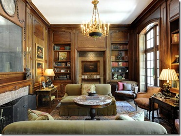
This looks like a library. Truthfully, I have no idea where this is in the home. Perhaps on one side off the entry? The window looks like it could be one of the front windows/French doors.

02707056_06

The master bedroom, very French in feel with the built in trumeau above the fireplace, the settee, French commode as a side table, and of course the fabric and wallpaper (or perhaps, fabric on the walls). Even the duvet cover has this fabric. I think this is a wing off the back of the house.
02707056_07

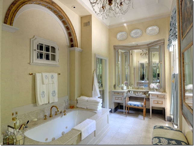
A beautiful and very feminine 'hers' bathroom.

02707056_08

The requisite wine cellar, in the basement.

02707056_09

A media room, also in the basement - but I like how this one is decorated in French style as well! Also, note the paneling on the walls. Only the finest of homes finish the basement to such a high standard.

02707056_10

The downstairs office and exercise room, also finished with paneling and hard wood floors.

02707056_11

This must be one of the rooms upstairs! Although this is not my style, it is very French, no?

02707056_14

My favorite kind of back elevation - two wings that make a courtyard. In Atlanta, flat walk out back yards are very desirable, but not that common given our hilly terrain. This back yard is absolutely beautiful with 8 sets of French doors opening to the back. How I would love to actually go in this house in person - I wonder which room is along the back of the house? I am beginning to think that it might be the dining room, which would mean that the left wing is the family room, the right wing is the master bedroom.

02707056_13

A little pavilion, which houses the garage on the other side, sits at the end of the yard.02707056_12

The pavilion has an outdoor entertainment area.

02707056_15

One of the best landscape firms in Atlanta helped to create the sculpted garden in the back. I just noticed the Versailles planters in the back yard - I love those!

veranda_cover

This home graced the cover of Veranda in March/April 2006, and provides more clues to the layout as well as additional pictures of the beautiful interior. The home was photographed when designer Ginny Magher lived there; just a few months after publication, the home was sold to the new owners. What a great marketing brochure for the home - to have it on the market as a Veranda cover story! Even now, with the new listing, the fact that this home was on the cover of Veranda is a major marketing point. The cover featured the dining room - and I think my theory about the dining room spanning the back of the house was correct. The dining room doors open onto an expanse of green, which almost certainly is the manicured lawn of the back yard. A closer view of the floors can be seen, and the intricate molding in the walls.

veranda3 02707056_01

Here is a side by side comparison. Interesting, it looks like the table and chairs might have been sold with the house - the chairs are the same. It looks like the window treatments stayed as well. The new owners (on the right) put an antique mirror on the wall, as well as a rug on the floor. The trumeau over the fireplace was probably built in.

veranda2 02707056_02

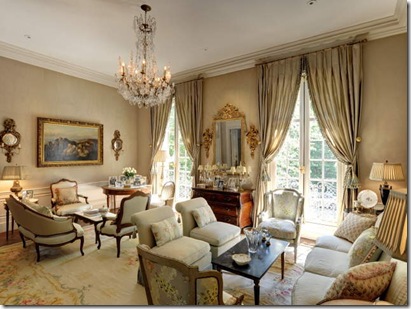
On the left, the living room as it was when Magher lived there; there are two seating areas, but Magher seems to have filled the room with more accessories and such. On the right, the current real estate listing. Some of the furnishings seem the same - the slipper chairs and some of the other seating, as well as the window treatments. The new owners have certainly stayed true to the French feel of the house, but in a more streamlined way. It does make me wonder whether they used Magher to help them decorate the home when they moved in.

veranda4 02707056_05

Here is the library/study - it looks like some of this furniture stayed with the house as well. The loveseats are certainly the same (the photographer for the real estate listing clearly modeled his shot off the Veranda spread). Again, the new owners have pared down the furnishings and accessories - even the loveseat is pared down, with just one pillow instead of four. As much as I admire both rooms, I do like the more pared down look that is going on.

veranda7 02707056_04

The family room has gone through quite a change. No longer is it lavender, and the curtains have been changed to the check instead of the toile. Again, fewer furniture pieces makes the room a bit less 'full'. I wonder if that painting on the wall (on the left) hid a TV? The TV is out in full view now, but I like how the new owners recessed it into the wall.

veranda5 02707056_06

The bedroom as it appeared in Veranda, with a dramatic canopy covered with the same material used on the walls and the curtains. I adore those large scale monograms on the shams on the bed. To the right, the room as the current owners have it decorated - again, using the same foundations, but in a more streamlined way. The new owner clearly has a love for Oriental rugs, which appear in most of the rooms now. The trumeau was either built in, or came with the house! Even the little bench in front of the fireplace seems to be the same.

veranda6 02707056_07

On the left, the bathroom as it appeared when Magher lived in the home. On the right, the more streamlined style of the new owners. I like how the new owners hung their own plates above the vanity; unusual in a bathroom, but such a lovely touch. It is also nice to see the beautiful stairs. When I saw the Veranda spread, I assumed that they were tucked to the side of the house. But now I think they might be right when you enter the house, based on the window on the landing. Does this mean that you have to go up to the main level - kind of like a split level home? I wonder.

veranda8 02707056_03

The Veranda spread shows a small picture of the kitchen, which is a bit less formal with the plaid shades over the island. Peeking through the door to the right, it looks like these are the double doors that lead out of the library. To the left - perhaps a big pantry and/or small kitchen office? Looking at the outdoor pavilion, it looks like the outdoor furniture stayed with the house, as it is the same as in the real estate listing.

Sometimes I wonder why I am interested in this kind of stuff. But I do like to see how two different owners decorate the same house, particularly when it is a house that was published in a national magazine! I like that the home is decorated in such a beautiful way, really in tune with the French style of the house. For more information on this home, please see the real estate listing.

All images via Veranda Magazine and the real estate listing.