In 2006, one of the most beautiful homes in Atlanta graced the cover of Veranda magazine. I always try to catch a glimpse of the house when I walk or drive by, no easy task given that the landscaping and topography of the lot make the house virtually hidden from view when at street level.
The house is described as 'hôtel particulier' style, which is defined as a French townhouse of considerable grandeur. According to Wikipedia, a hôtel particulier was often free standing (quite a luxury in a European city); by the 18th century, a hôtel particulier usually stood between an entrance court (like the one in this home) and the garden behind. The house was designed by Yong Pak of Pak Heydt and Associates; Pak Heydt are truly among the finest classical architects in the Southeast. The original owner of the house was Ginny Magher, an interior designer, and the home graced the cover of Veranda in the March/April 2006 issue (more on that later).
I am always thrilled when a beautiful house comes on the market in Atlanta, particularly one that has been published. It is even more interesting to see how a new owner has made their mark on the house. In this case, anyone who buys a house that is so clearly French in style probably has a love of all things French, including French interior design. The new owners did a wonderful job making the interiors their own, yet complimenting the beauty of the French style of the home. Let's take a look inside!
The dining room - look at those beautiful floors! This is quite a large dining room, and is one of the largest rooms in the house.
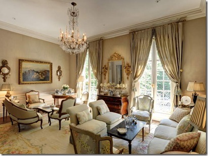
I love the soft feel of this formal living room, definitely designed for a lot of entertaining with its two seating areas. If I were to guess, I would say that this room is along the front of the house based on the fact that the iron grillwork can be seen in front of the French door (which can be seen in the front of the house).
The kitchen, which is quite elegant with its crystal chandeliers. I love the look of this kitchen; it has very few overhead cabinets, an arched window over the sink, and look at the glass front refrigerator to the left of the sink! Do you think the freezer is to the right of the sink? Although I really like wood on the floor of a kitchen, I also like the look of antique hexagon shaped terracotta tiles.
The arched windows and doors are definitely something that catches my eye when I look through this house, although looking at the other pictures, not every door or every window has an arch. This is the family room, adjacent to the kitchen (the table and chairs can also be seen in the kitchen picture), and it strikes me as overall formal (due to the crystal chandelier, ornate rug, and chairs), but the informal nature of the large scale check fabric on the curtains, chairs, and sofa helps balance out the room. I suspect that this room is one of the wings off the back, although I would need a floor plan expert like Joni to weigh in with her opinion!
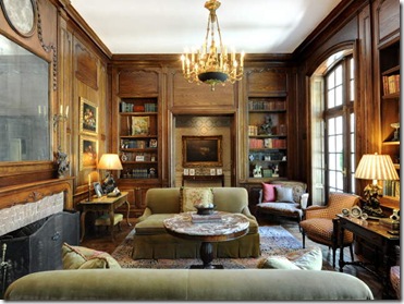
This looks like a library. Truthfully, I have no idea where this is in the home. Perhaps on one side off the entry? The window looks like it could be one of the front windows/French doors.
The master bedroom, very French in feel with the built in trumeau above the fireplace, the settee, French commode as a side table, and of course the fabric and wallpaper (or perhaps, fabric on the walls). Even the duvet cover has this fabric. I think this is a wing off the back of the house.
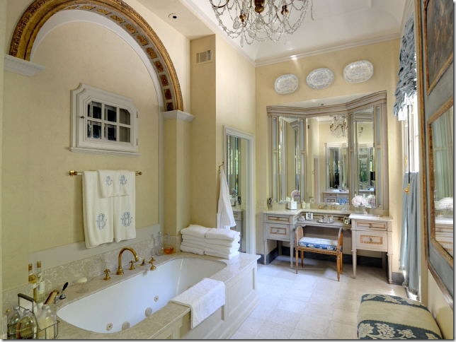
A beautiful and very feminine 'hers' bathroom.
The requisite wine cellar, in the basement.
A media room, also in the basement - but I like how this one is decorated in French style as well! Also, note the paneling on the walls. Only the finest of homes finish the basement to such a high standard.
The downstairs office and exercise room, also finished with paneling and hard wood floors.
This must be one of the rooms upstairs! Although this is not my style, it is very French, no?
My favorite kind of back elevation - two wings that make a courtyard. In Atlanta, flat walk out back yards are very desirable, but not that common given our hilly terrain. This back yard is absolutely beautiful with 8 sets of French doors opening to the back. How I would love to actually go in this house in person - I wonder which room is along the back of the house? I am beginning to think that it might be the dining room, which would mean that the left wing is the family room, the right wing is the master bedroom.
A little pavilion, which houses the garage on the other side, sits at the end of the yard.
The pavilion has an outdoor entertainment area.
One of the best landscape firms in Atlanta helped to create the sculpted garden in the back. I just noticed the Versailles planters in the back yard - I love those!
This home graced the cover of Veranda in March/April 2006, and provides more clues to the layout as well as additional pictures of the beautiful interior. The home was photographed when designer Ginny Magher lived there; just a few months after publication, the home was sold to the new owners. What a great marketing brochure for the home - to have it on the market as a Veranda cover story! Even now, with the new listing, the fact that this home was on the cover of Veranda is a major marketing point. The cover featured the dining room - and I think my theory about the dining room spanning the back of the house was correct. The dining room doors open onto an expanse of green, which almost certainly is the manicured lawn of the back yard. A closer view of the floors can be seen, and the intricate molding in the walls.
Here is a side by side comparison. Interesting, it looks like the table and chairs might have been sold with the house - the chairs are the same. It looks like the window treatments stayed as well. The new owners (on the right) put an antique mirror on the wall, as well as a rug on the floor. The trumeau over the fireplace was probably built in.
On the left, the living room as it was when Magher lived there; there are two seating areas, but Magher seems to have filled the room with more accessories and such. On the right, the current real estate listing. Some of the furnishings seem the same - the slipper chairs and some of the other seating, as well as the window treatments. The new owners have certainly stayed true to the French feel of the house, but in a more streamlined way. It does make me wonder whether they used Magher to help them decorate the home when they moved in.
Here is the library/study - it looks like some of this furniture stayed with the house as well. The loveseats are certainly the same (the photographer for the real estate listing clearly modeled his shot off the Veranda spread). Again, the new owners have pared down the furnishings and accessories - even the loveseat is pared down, with just one pillow instead of four. As much as I admire both rooms, I do like the more pared down look that is going on.
The family room has gone through quite a change. No longer is it lavender, and the curtains have been changed to the check instead of the toile. Again, fewer furniture pieces makes the room a bit less 'full'. I wonder if that painting on the wall (on the left) hid a TV? The TV is out in full view now, but I like how the new owners recessed it into the wall.
The bedroom as it appeared in Veranda, with a dramatic canopy covered with the same material used on the walls and the curtains. I adore those large scale monograms on the shams on the bed. To the right, the room as the current owners have it decorated - again, using the same foundations, but in a more streamlined way. The new owner clearly has a love for Oriental rugs, which appear in most of the rooms now. The trumeau was either built in, or came with the house! Even the little bench in front of the fireplace seems to be the same.
On the left, the bathroom as it appeared when Magher lived in the home. On the right, the more streamlined style of the new owners. I like how the new owners hung their own plates above the vanity; unusual in a bathroom, but such a lovely touch. It is also nice to see the beautiful stairs. When I saw the Veranda spread, I assumed that they were tucked to the side of the house. But now I think they might be right when you enter the house, based on the window on the landing. Does this mean that you have to go up to the main level - kind of like a split level home? I wonder.
The Veranda spread shows a small picture of the kitchen, which is a bit less formal with the plaid shades over the island. Peeking through the door to the right, it looks like these are the double doors that lead out of the library. To the left - perhaps a big pantry and/or small kitchen office? Looking at the outdoor pavilion, it looks like the outdoor furniture stayed with the house, as it is the same as in the real estate listing.
Sometimes I wonder why I am interested in this kind of stuff. But I do like to see how two different owners decorate the same house, particularly when it is a house that was published in a national magazine! I like that the home is decorated in such a beautiful way, really in tune with the French style of the house. For more information on this home, please see the real estate listing.
All images via Veranda Magazine and the real estate listing.


