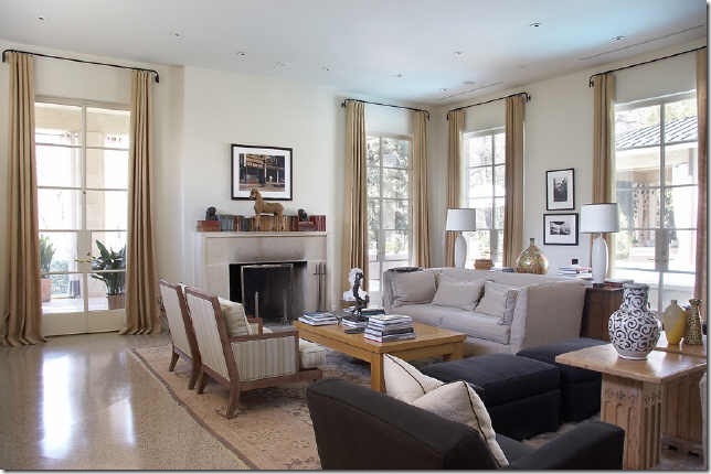
In my last post on steel windows and doors, I noted that rooms with windows on two sides (I was reflecting on the beautiful room above, which is in a French pavilion style home with wings off the back of the home) are instinctively pleasing to me. One of my readers, Terry from Architecture Tourist, commented that 'light on two sides' is in fact an architectural principle that is covered in great detail in the book 'A Pattern Language' by Christopher Alexander. 'A Pattern Language' discusses plans for building that are based on natural considerations, one of which is natural light. Alexander conducted studies and found that people feel the most comfortable in rooms that have windows on at least two different sides of the room, and find rooms like these to be more pleasant and choose them over rooms (in the same house) that have windows on only one side or no windows at all. Looking through some of my favorite images in my inspiration files, I saw image after image where there are indeed windows on two sides of the room. Quality of light in a room and a home has always been very important to me, and a room with windows on two sides naturally has a good quality of light (or at least, a fair amount of natural light) due to the fact that there are two exposures.
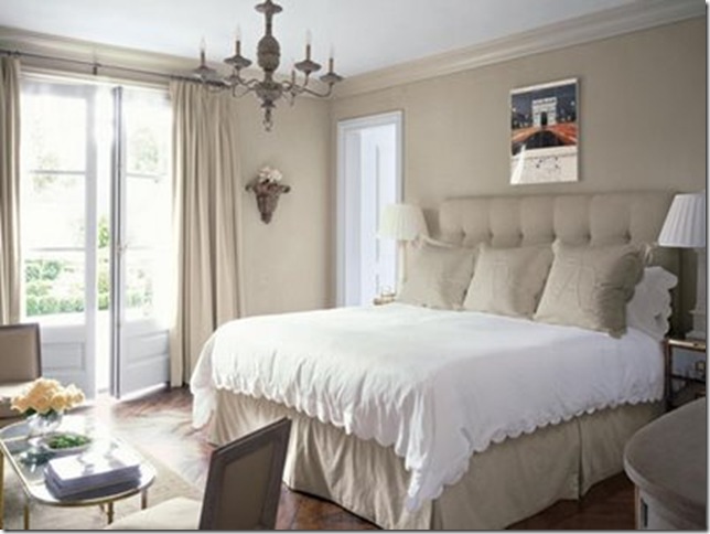
My favorite guest room, in the home of designer Lori Tippins, has windows on two sides; the combination of the soothing color scheme and the lovely light that comes in from the north and west makes this one of my favorite rooms ever. Many of the rooms in Lori's home were consciously designed to have natural light from multiple exposures.
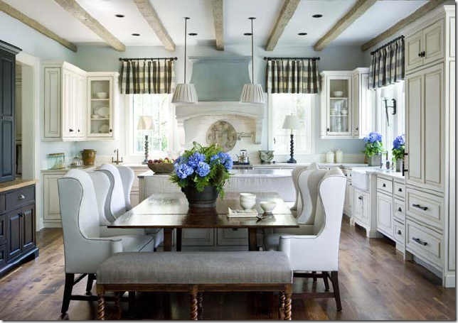
This breakfast room, from the Atlanta Homes and Lifestyles Christmas showhouse, gets light from the south, east, and west. This space was by far my favorite from the showhouse; the windows and light certainly contributed to the light and airy feel that so captivated me. Interior design by Liz Williams.
This room, from an old Atlanta real estate listing, was saved to my 'favorites' file because of the doors and windows that let so much light into the space.

One of my favorite family rooms - perhaps because of all of the light that comes in from the windows and doors that are on two sides of the room. Before I saw this house in person, I did not understand how this room was able to have windows on two sides; it is actually a wing that goes out from the back of the house. Wings are a very effective way to bring in more natural light into a home, and also have the effect of defining the outdoor spaces of a home.
One of my favorite rooms by Ginger Barber, via Cote de Texas. In traditional symmetrical floorplans, the living room is often in one of the front corners of the home and has the advantage of windows on two sides of the room.
This family room, from an Atlanta real estate listing, is in a wing off the back of the house, and actually has windows on three sides of the room. Creating a space that has both lots of natural light as well as wallspace for furniture and vignettes is something I will certainly ask the architect of my future home to take into consideration.
A beautiful room with tall doors on two sides of the room makes this space filled with light. Photo by the talented photographer Emily Followill.
This master bedroom, from a home in California with interior design by Betty Burgess, has beautiful French doors off the back. I am interpreting the opening to the left of the bed to be a window, but now I am wondering whether it is a door? Image via Veranda.
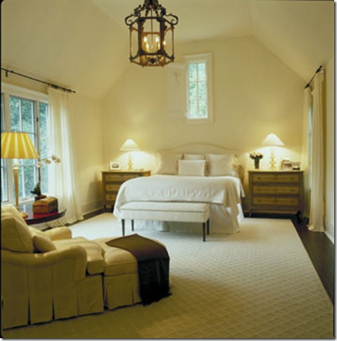
This bedroom (from an Atlanta real estate listing) has windows on three sides. Even the little window above the bed (with its charming shutter) gives a feeling of light, and proves that a windows does not have to be large to convey a feeling of light.
This bedroom, from a Century furniture catalog, was in my 'virtual home 2008'. Although I like the general style of the room, what really appeals is the lightness of the room and the windows and doors that bring in light from two sides.
This room has windows and/or doors on three sides! The design must have been challenging because of the width of the room and the multiple windows and doors. Interior design by Ingrao.
This beautiful room, captured by photographer Mali Azima, is perhaps one of my favorite living rooms from an architectural perspective: tall French doors on two sides of the room are both beautiful and let in ample natural light. I would love to see what the outside of this home looks like!
This living room, from a home by architect William Hefner, has a similar design, but uses windows on either side of the fireplace instead of doors.
I also love it when a kitchen has light coming in from two sides - this is a great way to achieve the look, with a small sidelight.
A small sidelight is seen in this kitchen too - the kitchen was designed by Atlanta kitchen designer Cynthia Ziegler, and was on a tour of homes in early May.
A kitchen designed by Barbara Westbrook, with light on two sides of the room. This is often achieved by having few overhead cabinets, and by having the kitchen placed in the corner of the house.
The 'Southern Accents Top 10 Kitchen' that I posted earlier this year is also in the corner of the house, and the kitchen has light from two sides. This is one of the prettiest kitchens I have seen in recent years. Another important thing to note from an architectural perspective is that kitchens that have light from two sides typically do not have an attached garage, or the garage is set back or even 'drive under' (this particular house has a 'drive under' garage). Drive under garages are found quite often in Atlanta, where the topography is hilly and the lots can be quite narrow in prime areas. In homes like this, the garage is at the basement level, underneath the main living area. Newer homes with this set up typically have elevators or dumbwaiters so the owners can send the groceries upstairs. Although the desirability of this set up is questionable, the big advantage is that the garage does not take up space on the main level of the home and does not block the light.
Of course, creating a home that has rooms with light on two sides is easier if the home is a simple square with four rooms on each floor, but given the number of rooms that people like to have in their homes in 21st century life, this can be quite an architectural challenge. A Pattern Language addresses some ways in which this can be achieved, including wings and 'wrinkling of edges' by having additional corners.
Do you find rooms with light from two sides to be more pleasing? In my own home, which is Charleston style with the door on the left side of the house, several of the rooms have light on two sides, including my entryway, living room, master bedroom, and breakfast room. Although the back of my house is north facing, these rooms get light from two different exposures and give my house a light and airy feel (the bleached oak floors help too). I would love to hear if my readers have an awareness of a preference in their own homes.


