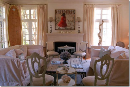
I enjoy perusing the real estate listings, and have been watching the listings for so long that I often see a home that was listed many years ago, and is now relisted. When looking at the 'new on the market' listings a few weeks ago, I noticed that a home I had featured on my blog two years ago was for sale again. I called the post 'Light Filled and Lovely'; I love the light coming in from two sides, the elegant furniture, the touches of periwinkle throughout the room, in the throw, the vase on the mantle, the stripe on the benches, and the contrast edge of the curtains (hard to see in this picture). I later learned that this was Suzanne Kasler's former home , which is featured under the 'Asheworth Court' section of her website.
I thought it was interesting to see the changes with the new owner. On the left: the real estate listing from two years ago, when Kasler was selling the home. On the right, the current real estate listing. When Kasler sold the home, Georgia was in the middle of a terrible drought. Now, the drought is over, and we have had the wettest spring in decades. The trees and landscaping have grown considerably, as you can see. Kasler kept plant containers to a minimum, with just a few Versailles planters along the walkway. The new owner has a few more, including two near the front door. Also, the right photograph was taken when the sun was casting long shadows on the front of the house. The picture on the left looks much clearer and cleaner because there are no shadows.
On the left, the entry as it was when Kasler lived in the home. On the right, the entry as it is with the new owner. The new owner stayed fairly true to the furniture and decor scheme that Kasler used, with a vertical piece of contemporary art, a settee, and a side chair.
On the left, the picture from the real estate listing when Kasler was selling the house. On the right, the living room from the new owner. The new owner's style is more casual, more eclectic. You don't see surf boards in a home too often in Atlanta! I love that driftwood sculpture on the right.
This is hardly a fair comparison, as I did not save the old real estate picture of Kasler's dining room; this image is of Kasler's former dining room, professionally styled and photographed. Several of the pieces in Kasler's dining room were the inspiration for her line of furniture for Hickory Chair (the settee and the buffet). On the right, the same dining room as the new owner has decorated it. It looks like the new owner kept the wall color, but Kasler took the pink silk curtains that made the room pop. The new owner has a round table, which works well in the space, and I love the new chandelier. Or maybe it is the chandelier that used to be in the breakfast room when Kasler owned the house. Overall, the space is not quite as formal, but still very pretty. If I were the owner, I would have used a rug that filled the room a bit more.
To the left, the kitchen as it was when Kasler lived in the home. See a hint of the chandelier? Yes, I think this was moved to dining room by the new owners. I wish I had saved the picture of the casual dining area of the kitchen, the big turned wood chandelier was really dramatic in the space! To the right, the kitchen as it is in the real estate listing with the current owner. It looks like a lot of things were kept the same - the subway tile backsplash, the marble countertops, the color on the walls. I love the bit of trim that is slightly below the moldings. The new owner added something on the vent - maybe antlers? It is amazing to see how different the colors appear in the professional picture - the walls look quite periwinkle on my monitor.
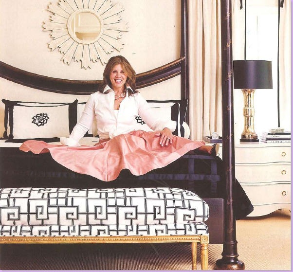
On the left, Suzanne Kasler poses in her former bedroom, in an article from Atlanta Homes and Lifestyles. On the right, the image from the real estate listing. The new owner also has a sunburst mirror above the bed, one of my favorite looks. The new owner also has a fourposter bed. Instead of a bench at the base of the bed, the new owner has a cute little dog bed!
It is fascinating to see how a home can take on a different character with different owners (and of course, a different decor style). Yet, the bones of the house remain the same. Some people have the ability to see beyond the decor of a home to the architectural bones; I must admit, I am quite influenced by the decor when I see a home, and sometimes I like a home for the decor rather than what is really important, the flow and the structure of the house. It is helpful to me to see how one house, with two different owners, can take on a different look and feel. For more information and pictures, please see the real estate listing.
Come see what is going on this week on the Hooked on Houses Friday blog party, and Between Naps on the Porch Metamorphosis Monday! Also, please make sure to stop by my 2 year blogiversary give away - a one of a kind item that cannot be found in stores!


