My favorite stores in Atlanta are Mrs. Howard and Max & Company. The Atlanta stores are situated in a high end retail area designed to have the look and feel of classic city townhouses; both Mrs. Howard and Max & Company are three levels, finished to feel like luxurious homes. Of course I love the furniture and accessories in the store, but truthfully I get just as much inspiration from the beautiful architectural details in both spaces. I have never seen a store before with such exquisite attention to architectural detail, and the design of architectural detail in the stores were the sole domain of the talented designer James Michael Howard.
Jim graciously agreed to answer some questions for me, as part of my inspirational architecture and design series. Interspersed with the questions are examples of Jim's work in both architectural and interior design.
Designer Jim Howard chats with a guest at the opening of the Charlotte 'Mrs. Howard' store. Image via Charlotte Observer, photo by Photo by Olivia Fortson.
Q: How did you decide to pursue a career in architectural and interior design?
A: Actually, I fell into it by accident. In high school I worked after school for a furniture store doing deliveries and odd jobs. My only goal after high school was to move to New York and see the big city. I heard about Parsons School of Design and enrolled in what I thought that 'furniture school'.
The foyer of Atlanta's Max & Company store. Customers enter through an octagonal shaped space, with a beautiful patterned wood floor. This really sets the tone for the experience at Max& Company. Jim is responsible for the architectural design of all of the Mrs. Howard and Max&Co stores.
Q: Where do you draw inspiration from? Particular architects, designers, things, places?
A: Good design is everywhere! My office makes fun of me because I'm always saying that good things can be found in carefully concealed places called...books! I travel a good bit and always carry a sketchbook. It helps me record information about a useful detail, or resource.
The hexagon floor tiles, carefully chosen by Jim Howard, at Max & Company Atlanta. They truly take the space from good to great. There are so many variations in color in the tiles, making it the perfect grounding for the ever changing furniture scenes in this room.
Q: Do you have a particular style you favor (French, English, Belgian, etc)?
A: I am easily satisfied with the best of anything! Being an American, I like the mixture. Americans want it all. When planning any house, however, I usually take design references from the architectural language established by the architect. The most exciting houses have done have a mixture of design references including Irish, Belgian, Dutch, etc. The clients set our the agenda, but recognizing the styles, knowing the guidelines, the do's and the don'ts and managing them is my job.
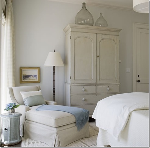
This room, designed by Jim Howard, is so balanced and pleasing to me. Nothing seems heavy in here, and the curtains are beautiful - they provide a softening effect for the room, yet they also let a lot of light into the room.
Q: What are your favorite exposures for quality of light (N, E, S, W, or any variation)?
A: I inherit the house, its location on the site, and work from there. Light is your friend, but it is not the exposure. It is managing that exposure and the view that comes with it. I care more about what you see with that exposure. Sometimes the windows are beautifully placed in a room with wonderful light and views and sometimes they are not. Windows are a design element and one of the backdrops for your room. I am fortunate enough to work on some projects with pretty good views, but that is not always the case. Never let the window treatment compete with the view, and ALWAYS let the light in!
I love this detail around a round window on the third floor the Max & Company Atlanta store. It is sculptural and adds a nice third dimension to the window.
Q: What type of projects do you work on (i.e. size of home, renovations, new construction)?
A: Size does not matter; I do both residential new construction and renovations. Projects vary widely from a house we just completed on the island of Bermuda, a recent house in the mountains of Montana, a Cape Cod renovation, to a hybrid in Jacksonville Beach. When I am hired by the client I immerse myself in books and design resources to develop the best design features for that particular style. I begin with the interior architecture and fold the client's existing things into that envelope and fill in the blanks. I will take any project where the client is open-minded, and kind never hurts.
Here is a room that was a recent Jim Howard project; he was responsible for both the decor and the architectural details. There is a richness and layered effect to this room that I love. There is symmetry, but also individual elements that keep the eye moving around the space.
This picture, of the same room, shows the beauty of the wood floors.
A detail shot highlighting the intricate carvings on the mantle.
Q: What projects are you working on now?
A: Fortunately in this economy we have quite a few projects! Our newest Mrs. Howard/Max & Company is complete and opened in Charlotte, North Carolina on August 5th. It is a two story Regency building built in 1925 and is a treasure trove of design experiences. Max & Company is getting a more modern perspective, but still maintains a relaxed and casual look. My design influences were more Frank, Giacometti, and Eileen Gray. That look is timeless and edgy at the same time. Mrs. Howard (in Charlotte) has 12 to 15 foot ceilings and huge windows. The building was formerly the Charlotte Women's Club, but one of the rooms is a huge paneled room that Phoebe (Jim's wife) dubbed 'Men's Club'. There is a sepia and grisaille mural in one of the bedrooms, an Etruscan room, a free floating stone staincase with a skylight as big as Texas. If you have been in one of our stores the message is the same, but bigger. It is by far our biggest store to date.
I am also working on a stone house in Little Rock, Arkansas in a beautiful setting designed by P. Allen Smith. The house is lovely and folded perfectly into the neighborhood. Sveral beach houses, of course, one of them in Sea Island and a pseudo modern Greek house in Atlanta. We just wrapped up a house in East Hampton, New York, with six bedrooms. The house was designed and completed in nine months! Whew!
The entry of Max & Company Charlotte creates another spectacular first impression. I love the shape of this room, but I think it is the floor that steals the show.
I have not yet visited the newly opened Max & Company Charlotte store, but it looks like the architectural details designed by Jim for this space are just as spectacular. The floor is is like a piece of art, definitely the star of this space.
A room on the second floor of Max & Company Atlanta. The composition of this scene has always been very pleasing to me, but look beyond to the architectural details in the room - the dentil molding and the square panels are spectacular.
A detail shot of the mantle on the second floor of Max & Company Atlanta. Have you ever seen a store with such magnificent architectural details?
Q: What is something you should not skimp on when designing your home?
A: Enthusiasm, dreams, passion, and of course...me! Don't be afraid to take chances and don't be lazy! Every angle must be considered, reconsidered, and considered some more. Think of yourself as a designer in an upcoming showhouse. You only get one shot to make that room the best. Take it piece by piece, one room at a time.
This is perhaps my favorite image from Jim Howard's design portfolio. Every touch is just right, from the shape and lines of the furnishings to the little touches like the height of the painting - the eye travels from one side of the room to the other, taking in every single component.
Q: What trends are you seeing in your projects? Smaller, larger, green? Classical, modern, the blending of the two?
A: I am working on my first green house. The client is from Houston and formerly in the energy business, so he knows all of the tricks. It will be LEED certified. The industry is catching on and more and more products and green.
Obviously people are embracing a more modern aesthetic lately, and it is exciting! We are seeing some really talented artisans that are emerging with fresh new perspectives on existing ideas. We have worked very closely with our design partners to develop new products that are extraordinary and affordable. After all, it is not just what you know but who you know. The trends now are that good design has become far more affordable.
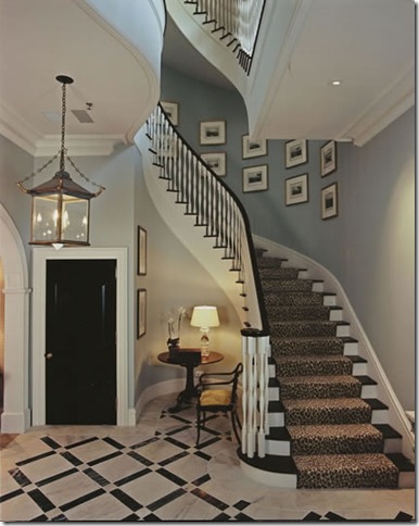
One of my favorite pictures of the beautiful architectural details that Jim designed in Mrs. Howard, Atlanta. The pattern in the marble floor is a great balance for the gently curbe of the stairs. These are details that are not seen in many new homes these days, so to find them in a store is remarkable.
Q: Is there a fad you hope to never seen again?
A: I wouldn't call it a fad, but can we PLEASE get past mid-century!
I hope you enjoyed this interview with designer Jim Howard. For more information on Jim, (as well as dozens of inspiring pictures from his portfolio) please visit his web site.


