I love houses, and find the differences in home designs to be fascinating. One thing I always notice is what I see when I enter the front door. Is there a view from the front to the back? Are the stairs immediately in front? Perhaps this is too much of a generalization, but it seems like many older homes often have a wall or stairs on a wall when entering a house. It also seems like many homes I have seen in the past 2 years do not have the stairs front and center, but rather have the stairs tucked away to the side. When looking at real estate photos, I wish there were more pictures capturing the views from the entry to the back of the house; to me, this is what sets the stage for the house.
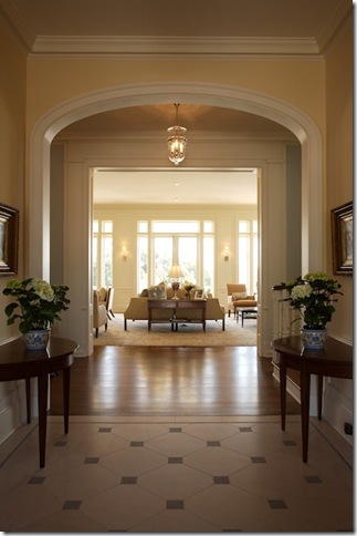
This beautiful home designed by Steve Giannetti has what I consider to be my favorite axial view when entering a house: a view from the front to the back. The stairs are in the hall between the entry and the living room.
This picture is from an old real estate listing. I thought that the entry was similar to mine, however in my house I see through to the back of the house through the living room. I can't help but wish that there was a view through to the back of the house when looking at this picture!
I am not sure where this gorgeous room is located in its Parisian townhouse, but I like to imagine this is the view when entering the home. Does it matter if the view is not centered? to me, it does not. A beautiful view like this would be a great reward for the eye when entering a home. I suppose that the view when entering a city apartments is not as easy to control as it is in a large home, as much is determined by the apartment's location and position in a building.
Here is a picture from the set of the Nanny Diaries, which portrays a luxe Upper East Side apartment. There is a view from the entry hall through to the living room. Image via Traditional Home.
This was the Regency style home that was used as the Atlanta Homes and Lifestyles Christmas showhouse in 2008. The house was large and formal, but I liked how the view from the front door went through to the back. The living room was decorated by Suzanne Kasler, and the beauty of the room is a lovely reward at the end of the view. Often the living room is on one side of the entry, the dining room on the other side (in traditional symmetrical floor plans); in this house the library/study is on the left, the dining room on the right. The living room has a door that opens to the family room and breakfast area, which in turn open to the kitchen. Although the house is quite large and grand, I thought that the floor plan on the main level flowed really well.

I love blog house tours from Joni of Cote de Texas - she is as obsessed with floor plans and views as I am! She always shows the view from the front door to the back of the house, which really helps set the stage for the house. This house was on a home tour in her neighborhood, on an unusually deep lot for the area. To see more of the house, please see her post.
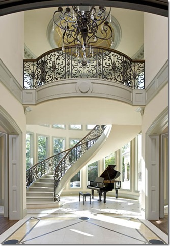
A very sculptural floating staircase and a grand piano greet the visitor when entering this house. This floor plan essentially divides a house in two, doesn't it?
The Swan Coach House in Atlanta has a similar perspective when entering through the front door.
An attractive stairway makes a great first impression, and the Gothic style Tudor door prevents this area from being a dead end. Although you do not see through to the back of the house, the doorway provides a glimpse at the rooms in the back of the house.
An unusual view of the Blue Room in the White House - when you enter the White House through the front door, this is the room that is seen through to the back. Most of the pictures of this room have a huge Christmas tree blocking the view - this is where the official White House Christmas tree is placed. Image via Washington DC photographer Kristoffer Tripplaar.
The entry from Suzanne Kasler's old home did not have a view to the back - instead the visitor was greeted with a wall - but she made it a beautiful focal point with contemporary art and an antique French day bed.
Here is another entry where you walk in and see a wall, in a home that belonged to a friend. The home was built in the 1920s on the Chesapeake Bay, and the floorplan could not be changed from the original footprint. In designer Jim Hawes' words:
"The single, most difficult design aspect of this house was the entry. A two story high fireplace wall set just 10 feet back from the double glass door entry created a formidable physical and psychological barrier to arriving guests -- and the wall could not be moved. On entering you felt you had literally "hit" a wall. Instead of a mirror, we used a pair of antique French conservatory windows mounted on the wall -- the wavy glass panes providing a mirror of sorts, and much greater sense of depth. A sugar marble topped antique Swedish pine table offered a perfect compromise of weight/mass and lack of depth! Accessories and furnishings were kept simple, but refined. A South Seas clam shell filled with miniature sand dollars, oversize hurricane lamp, two silver candlesticks and a wonderful Meiji bronze crab dress the table. A marvelous fluted 19th century pedestal and whitewashed bamboo style arm chair flank the table." Don't you love hearing the thought process behind the design? Image via Caldwell-Beebe.
A picture from an Atlanta real estate listing. A pretty standard front hall with staircase - I really do not like to see the library table blocking the view to the back. Not only does it block the view, but it interferes with the traffic pattern of the hall.
This picture has been featured on just about every blog I know! There is something about it that really strikes a chord. Occasionally, the casual dining area is the view from the front to the back, as this is often the area that is the middle ground between the family room and the kitchen, and in modern floor plans (and renovations) the family room and kitchen often span the back of the house. Image via Traditional Home.
This entry, from an Atlanta real estate listing, is quite beautiful. But, I must admit, I prefer entries that are not so closed - I like to see through to the back of the house. When looking at potential houses for purchase, a closed entry is a deal breaker to me.
This home was on the market many years ago, yet I saved all of the pictures because I really liked how the house flowed. This is the perspective from the front door; the living room can be seen through the door openings, and the three sets of French doors open to the back yard. The one thing I would change: the living room is on its own, a bit of a dead end. Theoretically, one could go out the back doors and in through the outside doors to the family room, but I think it would be nicer to have a door or opening that connects the living room to the family room/breakfast area. The kitchen is on the right side of the house, and the family room is a wing that goes off the back of the house, also opening to the pool.
This home, from a high end spec house in Atlanta, has a view from the front to the back with a fireplace in view. For me, the important thing is to see from the front to the back; I don't mind looking at a fireplace, as long as there is a clear view through the house.
A view in an old real estate listing. Often when the family room and kitchen span the back of the house, a 'middle ground' is the view from the front of the house - and often there is a round table.
This is a home currently on the market in Atlanta. Although there is not a picture from the front door, I have been in this home and know that the front looks through to this hall in the back of the house. The house forms a 'U' shape; the master bedroom is one side of the 'U', the family room the other side of the 'U', and in the middle (off this hall) is a courtyard.
The home of one of Cote de Texas' clients - I love the glimpse at the beautiful living room from the front door.
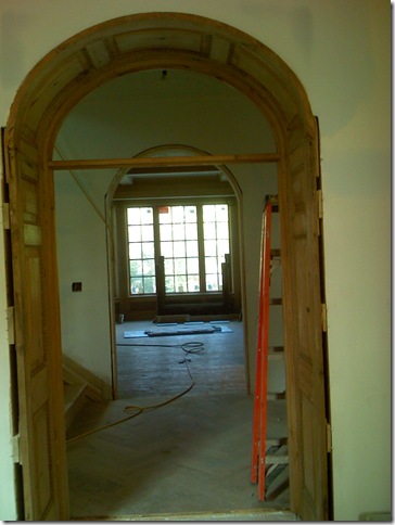
Last year I walked through a home that was being constructed, and liked the view from the front to the back, through two arched entrances. The room in the back is the family room. The stairs are in the middle hall. Seeing these floors was the inspiration for my post on chevron and herringbone floors.
The home I featured earlier this year - currently for sale, and the winner of the Southern Accents 2009 Kitchen of the year, has a hall that spans from the front of the house to the back. The view from the front is this sitting area, which is the middle ground between the kitchen and the family room.
Readers, now it is your turn to chime in! I would love to hear what you see when you enter the front door of your home. Do you like it? If not, what would you see when you enter the front door of your 'dream house'? For those of you reading this by email, click here to comment. I look forward to reading your responses!
To subscribe to my blog by email, please click here.


1 comments:
Incredible hearing the stories that went into the designs. Love the piano room ! Spectacular
Post a Comment