One of the most beautiful neighborhoods in the Buckhead area of Atlanta is called 'Haynes Manor'. The neighborhood was developed between the late 1920s and the 1940s; most of the homes are charming bungalows, cottages, and small manor style homes influenced by French and English style. I have shown quite a few pictures of homes from Haynes Manor on my blog through the years, and this is the area that design luminaries Dan Carithers and Suzanne Kasler call home.
When walking through the area, it is remarkable to see how few homes have been torn down and replaced with new homes. The majority of homeowners instead choose to carefully renovate the original homes, and love the quirky charm and unique features characteristic to older homes. I pass by one such home on one of my favorite dog walking routes, and was amazed to see pictures of its transformation on the Land Plus facebook page. This home, which is owned by the founders of Land Plus Associates, one of the premiere land planning and landscape architecture firms in Atlanta, was featured in Southern Living in 2007.
Here is a picture of the Buckhead bungalow as it looks today. This looks exactly like the storybook style house I used to draw as a child, complete with a welcoming path from the sidewalk, a big bay window, and an American flag waving by an arched entry covered with vines.
A close-up of the front door. I love the shutters on the door - it looks like they can actually be closed should the owners decide that they want a bit more privacy. My favorite doors have windows in them, but sometimes it can be a bit much to have so much of a view into a home. The shutters are the perfect solution!
Off the driveway, there is an arbor gate entry into the rear yard.
A view of the back yard and the rear elevation of the home. If I had a back yard like this, I'm not sure I would ever want to go on vacation - what a beautiful oasis in the middle of a busy city.
A grouping of container gardens bring some color into the backyard.
This is one of my favorite features - a charming guest house over the two car garage. I love the entrance to the house, which is focused on the backyard. The owners say that their guests love the privacy and beauty of the guest house.
The owners call this area 'the morning courtyard' - a perfect place to drink a cup of coffee and read the paper.
The kitchen was transformed when the owners moved into the home 10 years ago.
My favorite feature in a kitchen - an expanse of windows over the sink.
The dining room in the renovated home; I have the same dining room chairs, and I like how the owners have slipcovered them and use a different chair at the head of the table.
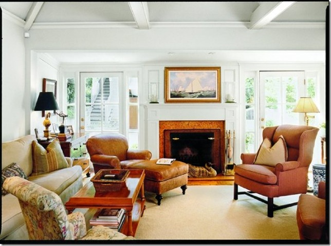
The renovated family room. I love the sidelights on the doors that lead outside to the back.
Now - here are the before and after pictures side by side! This is where the full transformation of the bungalow can really be appreciated.
On the left, the bungalow before the transformation. The home had been 'updated', but the original charm and character of the 1930s bungalow had been stripped out of the home. The owners' realtor had seen the house and knew that they could do a stunning transformation and restore the home back to its original charm. On the right, the home as it is today. It is fascinating to see the changes - the basic shape of the home is the same, but the details have been improved with a stunning result. All of the windows have been changed, and are much more in line with the feel of the neighborhood and the original age of the home (built in 1930). The front entrance is much more beautiful now with its arch and greenery. I love the dormer window added to the roofline on the right, and the charming gas lamp by the front walk.
On the left, the back of the home before the renovation - a series of small windows with very little relation between the inside and the outside, the house and the yard. On the right, the backyard as it is today - the addition of an arbor and the stone wall softens and beautifies the back, and makes more of a connection between the hardscape and the home.
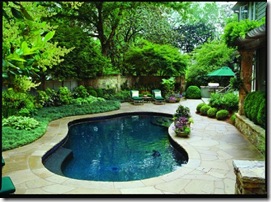
On the left, the back yard before. It looks like the owners kept the same pool, but refurbished the decking and clearly transformed the hardscape and landscape of the back yard.
On the left, the kitchen as it was before the transformation. On the right, the kitchen, after. It looks like there were quite a few structural changes to the space, based on this picture.
It is always inspirational to see an older home that is given a new life with an expert renovation by owners with vision and talent. Given that far fewer people are tearing down and building right now, due to the downturn in the economy and the greater awareness of the 'green' aspect of preserving and reusing what is already there, I found this example of a beautifully renovated home to be particularly interesting.
For more information on Land Plus Associates, and examples from their magnificent portfolio, please visit their web page or their newly created Facebook page.
For more transformation projects, please come visit the 'Metamorphosis Monday' over at Between Naps on the Porch. There are lots of great ones this week!


0 comments:
Post a Comment